반응형
svg icon 사용법
svg 아이콘 이름이 icon-home인 경우 아래와 같이 작성
<use xlink:href="img/sprite.svg#icon-home"></use>
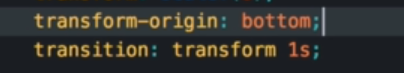
transform-origin
애니메이션이 시작되는 방향을 설정할 수 있다
여기까지 완성
_layout.scss
.container {
max-width: 120rem;
margin: 8rem auto;
background-color: var(--color-grey-light-1);
box-shadow: 0 2rem 6rem rgba(0, 0, 0, 0.3);
min-height: 50rem;
}
.header {
font-size: 1.8rem;
height: 7rem;
background-color: #fff;
border-bottom: var(--color-grey-light-2);
display: flex;
justify-content: space-between;
align-items: center;
}
.content {
display: flex;
}
.sidebar {
background-color: var(--color-grey-dark-1);
flex: 0 0 18%;
display: flex;
flex-direction: column;
justify-content: space-between;
}
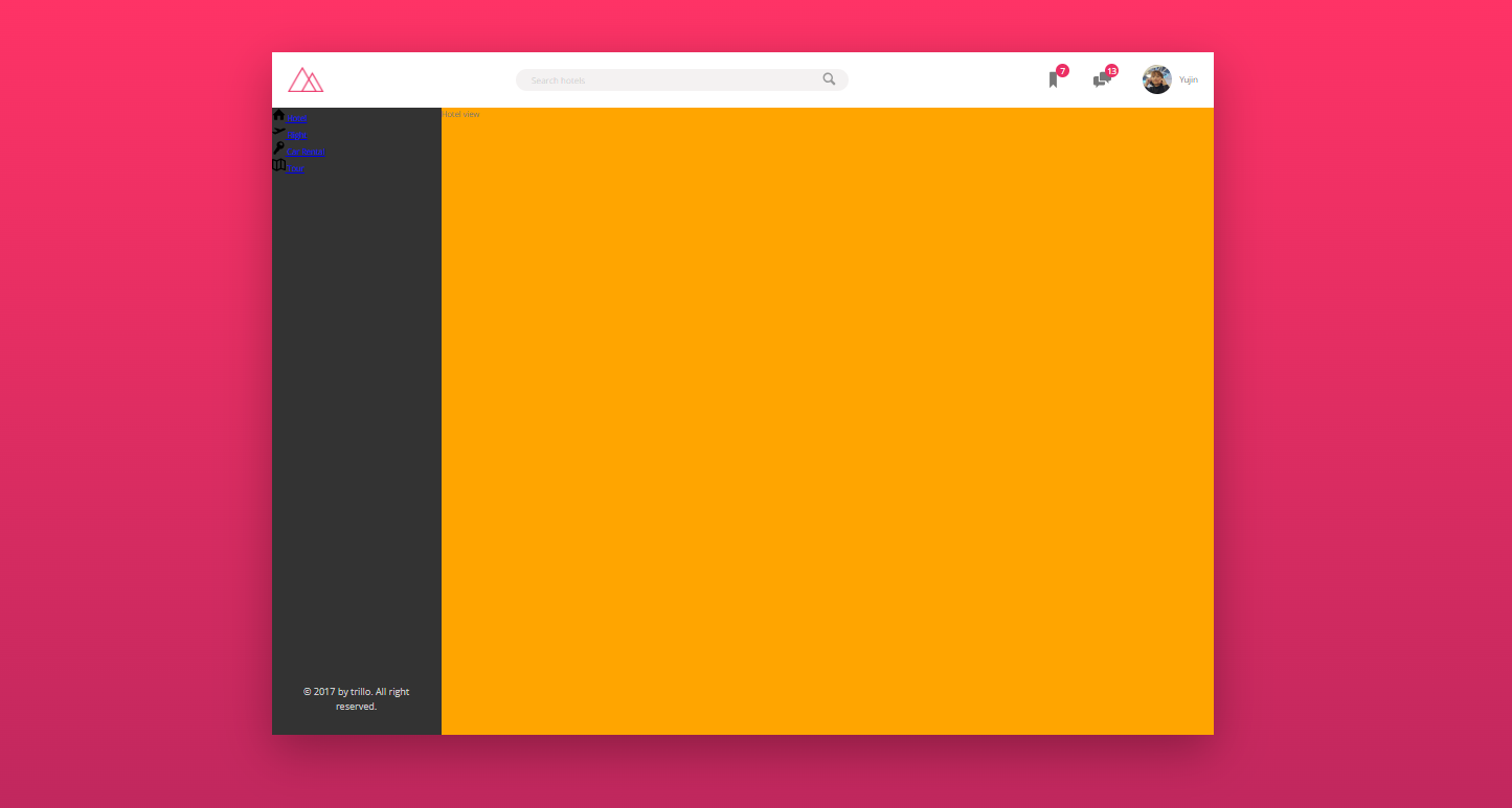
.hotel-view {
background-color: #fff;
background-color: orange;
// height: 80rem;
height: 80rem;
flex: 1;
}
_components.scss
////////////////////////////////////////////////
/// LOGO

.logo {
  height: 3.25rem;
  margin-left: 2rem;
}

////////////////////////////////////////////////
/// SEARCH
.search {
  flex: 0 0 40%;
  display: flex;
  align-items: center;
  justify-content: center;

  &__input {
    font-family: inherit;
    font-size: inherit;
    color: inherit;
    background-color: var(--color-grey-light-2);
    border: none;
    padding: 0.7rem 2rem;
    border-radius: 100px;
    width: 80%;
    transition: all 0.7s;
    margin-right: -3.5rem;

    &:focus {
      outline: none;
      width: 100%;
      background-color: var(--color-grey-light-3);
    }

    &::-webkit-input-placeholder {
      font-weight: 100;
      color: var(--color-grey-light-4);
    }
  }

  &__input:focus + &__button {
    background-color: var(--color-grey-light-3);
  }

  &__button {
    border: none;
    background-color: var(--color-grey-light-2);

    &:focus {
      outline: none;
    }

    &:active {
      transform: translateY(2px);
    }
  }
  &__icon {
    height: 2rem;
    width: 2rem;

    fill: var(--color-grey-dark-3);
  }
}

/// ////////////////////////////////////////////////
/// USER NAVIGATION
.user-nav {
  display: flex;
  align-items: center;
  align-self: stretch;

  & > * {
    padding: 0 2rem;
    cursor: pointer;
    transition: all 0.3s;
    height: 100%;

    display: flex;
    align-items: center;
  }

  & > *:hover {
    background-color: var(--color-grey-light-2);
  }

  &__icon-box {
    position: relative;
  }

  &__icon {
    height: 2.25rem;
    width: 2.25rem;
    fill: var(--color-grey-dark-2);
  }

  &__notification {
    font-size: 0.8rem;
    height: 1.75rem;
    width: 1.75rem;
    border-radius: 50%;
    background-color: var(--color-primary);
    color: #fff;

    position: absolute;
    top: 1.5rem;
    right: 1rem;

    display: flex;
    justify-content: center;
    align-items: center;
  }

  &__user-photo {
    height: 3.75rem;
    border-radius: 50%;
    margin-right: 1rem;
  }
}

/// ////////////////////////////////////////////////
/// SIDE NAVIGATION
.side-nav {
  &__item {
    list-style: none;
  }

  &__link {
  }

  &__icon {
    width: 1.75rem;
    height: 1.75rem;
  }
}

/// ////////////////////////////////////////////////
/// LEGAL TEXT
.legal {
  font-size: 1.2rem;
  color: var(--color-grey-light-4);
  text-align: center;
  padding: 2.5rem;
}
반응형
'온라인 강의 > Advanced CSS and Sass [Udemy]' 카테고리의 다른 글
| 80. Building the Hotel Overview - Part 1 (0) | 2023.08.03 |
|---|---|
| 79. Building the Navigation - Part 2 (0) | 2023.08.03 |
| 77. Building the Header - Part 3 (0) | 2023.08.03 |
| 76. Building the Header - Part 2 (0) | 2023.08.03 |
| 75. Building the Header - Part 1 (0) | 2023.08.03 |