반응형
계속 color 속성을 입력하는 것이 아니라 상위 요소를 그대로 가져올 수 있다
말 그대로 현재의 색상을 받아서 적용하는 것이기 때문에 hover 와 같은 효과에 주는 다른 색상도 자동으로 적용된
    // fill: var(--color-grey-light-3);
    fill: currentColor;
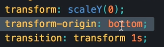
중앙이 기본 세팅이기 때문에 중앙에서 scaleY가 늘어나는 것을 볼 수 있다
기존에 있었던 종류들이 아닌 아래와 같이 처음에는 빠르고 뒤에는 느려지는 형태로 사용
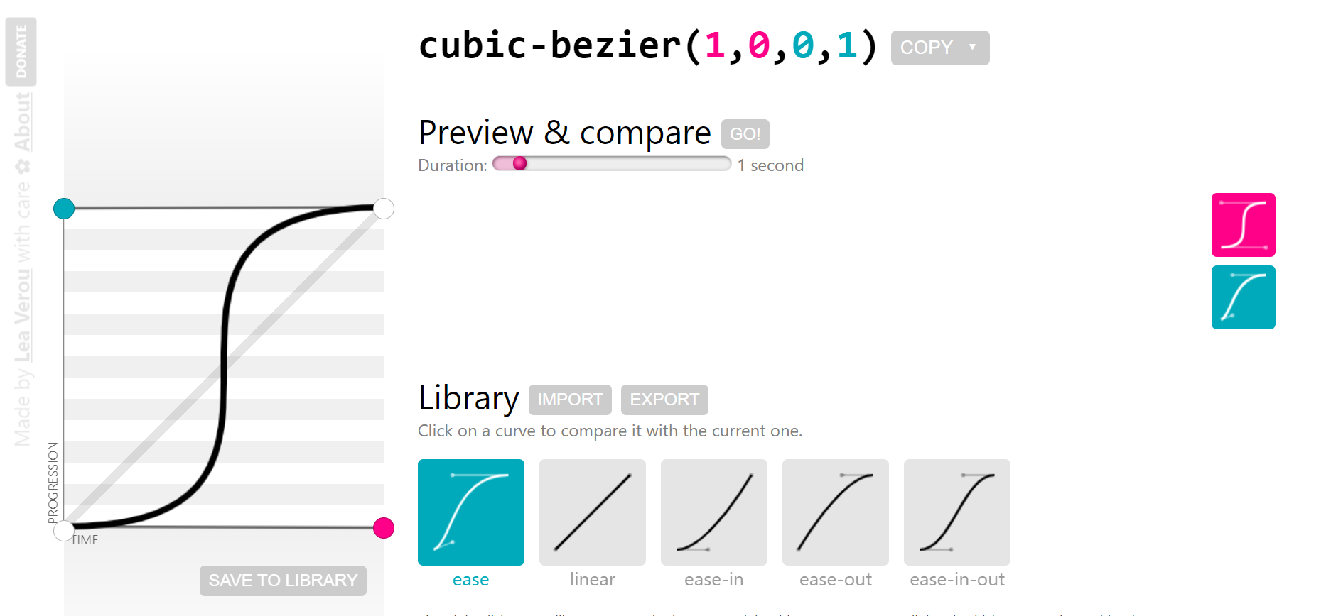
https://cubic-bezier.com/#1,0,0,1
cubic-bezier.com
cubic-bezier.com
z-index가 먹히지 않을 때는, postion 값이 설정되어 있는지 확인해보자
 transition: transform 0.2s, width 0.3s 0.2s cubic-bezier(1, 0, 0, 1),
      background-color 0.1s;
이렇게 transition 속성 내에서도 요소 별로 구분이 가능하다!
components.scss
////////////////////////////////////////////////
/// LOGO

.logo {
  height: 3.25rem;
  margin-left: 2rem;
}

////////////////////////////////////////////////
/// SEARCH
.search {
  flex: 0 0 40%;
  display: flex;
  align-items: center;
  justify-content: center;

  &__input {
    font-family: inherit;
    font-size: inherit;
    color: inherit;
    background-color: var(--color-grey-light-2);
    border: none;
    padding: 0.7rem 2rem;
    border-radius: 100px;
    width: 80%;
    transition: all 0.7s;
    margin-right: -3.5rem;

    &:focus {
      outline: none;
      width: 100%;
      background-color: var(--color-grey-light-3);
    }

    &::-webkit-input-placeholder {
      font-weight: 100;
      color: var(--color-grey-light-4);
    }
  }

  &__input:focus + &__button {
    background-color: var(--color-grey-light-3);
  }

  &__button {
    border: none;
    background-color: var(--color-grey-light-2);

    &:focus {
      outline: none;
    }

    &:active {
      transform: translateY(2px);
    }
  }
  &__icon {
    height: 2rem;
    width: 2rem;

    fill: var(--color-grey-dark-3);
  }
}

/// ////////////////////////////////////////////////
/// USER NAVIGATION
.user-nav {
  display: flex;
  align-items: center;
  align-self: stretch;

  & > * {
    padding: 0 2rem;
    cursor: pointer;
    transition: all 0.3s;
    height: 100%;

    display: flex;
    align-items: center;
  }

  & > *:hover {
    background-color: var(--color-grey-light-2);
  }

  &__icon-box {
    position: relative;
  }

  &__icon {
    height: 2.25rem;
    width: 2.25rem;
    fill: var(--color-grey-dark-2);
  }

  &__notification {
    font-size: 0.8rem;
    height: 1.75rem;
    width: 1.75rem;
    border-radius: 50%;
    background-color: var(--color-primary);
    color: #fff;

    position: absolute;
    top: 1.5rem;
    right: 1rem;

    display: flex;
    justify-content: center;
    align-items: center;
  }

  &__user-photo {
    height: 3.75rem;
    border-radius: 50%;
    margin-right: 1rem;
  }
}

/// ////////////////////////////////////////////////
/// SIDE NAVIGATION
.side-nav {
  font-size: 1.4rem;
  list-style: none;
  margin-top: 3.5rem;

  &__item {
    position: relative;

    &:not(:last-child) {
      margin-bottom: 0.5rem;
    }
  }

  &__item::before {
    content: "";
    position: absolute;
    top: 0;
    left: 0;
    height: 100%;
    width: 3px;
    background-color: var(--color-primary);
    transform: scaleY(0);
    transition: transform 0.2s, width 0.3s 0.2s cubic-bezier(1, 0, 0, 1),
      background-color 0.1s;
  }

  &__item:hover::before,
  &__item--active::before {
    transform: scaleY(1);
    width: 100%;
  }

  &__item:active::before {
    background-color: var(--color-primary-light);
  }

  &__link:link,
  &__link:visited {
    color: var(--color-grey-light-1);
    text-decoration: none;
    text-transform: uppercase;
    display: block;
    padding: 1.5rem 3rem;

    display: flex;
    align-items: center;

    position: relative;
    z-index: 10;
  }

  &__icon {
    width: 1.75rem;
    height: 1.75rem;
    margin-right: 1rem;
    // fill: var(--color-grey-light-3);
    fill: currentColor;
  }
}

/// ////////////////////////////////////////////////
/// LEGAL TEXT
.legal {
  font-size: 1.2rem;
  color: var(--color-grey-light-4);
  text-align: center;
  padding: 2.5rem;
}
반응형
'온라인 강의 > Advanced CSS and Sass [Udemy]' 카테고리의 다른 글
| 81. Building the Hotel Overview - Part 2 (0) | 2023.08.03 |
|---|---|
| 80. Building the Hotel Overview - Part 1 (0) | 2023.08.03 |
| 78. Building the Navigation - Part 1 (0) | 2023.08.03 |
| 77. Building the Header - Part 3 (0) | 2023.08.03 |
| 76. Building the Header - Part 2 (0) | 2023.08.03 |