반응형
03 반응형 웹 패턴
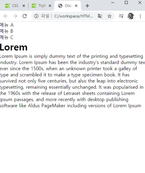
8-5 반응형 웹 패턴1


<!DOCTYPE html>
<head>
    <meta charset="UTF-8">
    <title>Document</title>
    <meta name = "viewport" content = "user-scalable-no, initial-scale=1, maxium-scale=1">
    <style>
        * {
            margin : 0;
            padding : 0;
        }
        body {
            width : 960px;
            margin : 0 auto;
            overflow : hidden;
        }
        #menu {
            width : 260px;
            float : left;
        }
        #section {
            float : left;
            width : 700px;
        }
       li {
           list-style : none;
       }

       @media screen and (max-width : 767px) {
           body {
               width : auto;
           }
           #menu {
               width : auto;
               float : none;
           }
           #section {
               width : auto;
               float : none;
           }

       }

    </style>
</head>
<body>
    <div id = "menu">
        <ul>
            <li>메뉴 A</li>
            <li>메뉴 B</li>
            <li>메뉴 C</li>
        </ul>
    </div>
    <div id = "section">
        <h1> Lorem </h1>
        Lorem Ipsum is simply dummy text of the printing and typesetting industry. Lorem Ipsum has been the industry's standard dummy text ever since the 1500s, when an unknown printer took a galley of type and scrambled it to make a type specimen book. It has survived not only five centuries, but also the leap into electronic typesetting, remaining essentially unchanged. It was popularised in the 1960s with the release of Letraset sheets containing Lorem Ipsum passages, and more recently with desktop publishing software like Aldus PageMaker including versions of Lorem Ipsum
    </div>
    </body>
</html>
반응형
'HTML5' 카테고리의 다른 글
| 종합 예제 2 (0) | 2020.11.03 |
|---|---|
| Chapter08 반응형 웹 (0) | 2020.11.03 |
| chapter 07 다양한 레이아웃의 구성과 기능, 연습문제 (0) | 2020.11.02 |
| 7-4 절대위치배치 7-5 요소의중앙배치 7-6 고정바배치 7-7 글자생략 (0) | 2020.11.02 |
| 7-preview, 7-1, 7-2 (0) | 2020.11.02 |