- 미디어 쿼리가 무엇인지 살펴봅니다.
- 반응형 웹을 구현하는 방법을 이해합니다.
1] 뷰포트 설정
meta 태그는 웹페이지에 추가 정보를 제공할 때 사용한다.
<meta name = "title" content = "ITCookbook HTML5 프로그래밍을 위한 페이지">
<meta name = "description" content = "meta 태그의 title 속성과 description 속성입니다.">
표 8-1 viewport meta 태그에 입력할 수 있는 값
width : 화면너비
height : 화면 높이
initial-scale : 초기 확대 비율
user-scalable : 확대 및 축소 기능 여부
minimum-scale : 최소 축소 비율
maximum-scale :최대 확대 비율
target-densitydpi : DPI 지정
2] 미디어 쿼리 설정
미디어 쿼리는 두 가지 방법을 사용할 수 있다.
@media 규칙과 media 속성이다.
@-규칙 @-rule이란 스타일시트 내부에서 특정한 규칙을 표현하는 데 사용하고, @로 시작한다.
외부 스타일을 가져오는 @import 규칙, 글꼴을 추가로 정의하는 @font-face 규칙 등이 있다.
최근 HTML 페이지를 다양한 장치에서 실행하면서 부각된 규칙이다.
media 속성은 link 태그에 입력해서 해당 미디어 쿼리 조건에 맞는 장치에서만 CSS 파일을 불러올 때 사용합니다.
@media (<미디어 쿼리>) {
	<CSS 코드>
}
(a) @media 규칙
<link rel = "stylesheet" href = "<파일이름>" media = "<미디어 쿼리>">(b) media 속성
기본 예제 8-2
모니터를 나타내는 'screen'과 프린터를 나타내는 'print'를 구분하자.
1. @media 규칙을 사용한 미디어 쿼리 사용하기
일반적으로는 배경이 빨간색이지만, 프린트할 때는 초록색이 되게 하기
<!DOCTYPE html>
<html>
    <head>
        <meta charset = "utf-8">
        <title>Media Type</title>
        <style>
        @media screen {
           body {
               background-color: red;
           }
        }

        @media print {
            body {
                background-color: greenyellow;
            }
        }
        </style>
    </head>
    <body>
        <h1>Lorem ipsum dolor sit amet </h1>
        <p> Lorem ipsum dolor sit amet, consectetur adipiscing elit.</p>
    </body>
</html>
2. media 속성을 이요한 미디어 쿼리 사용하기
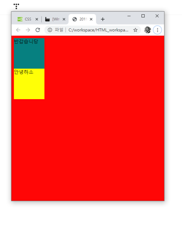
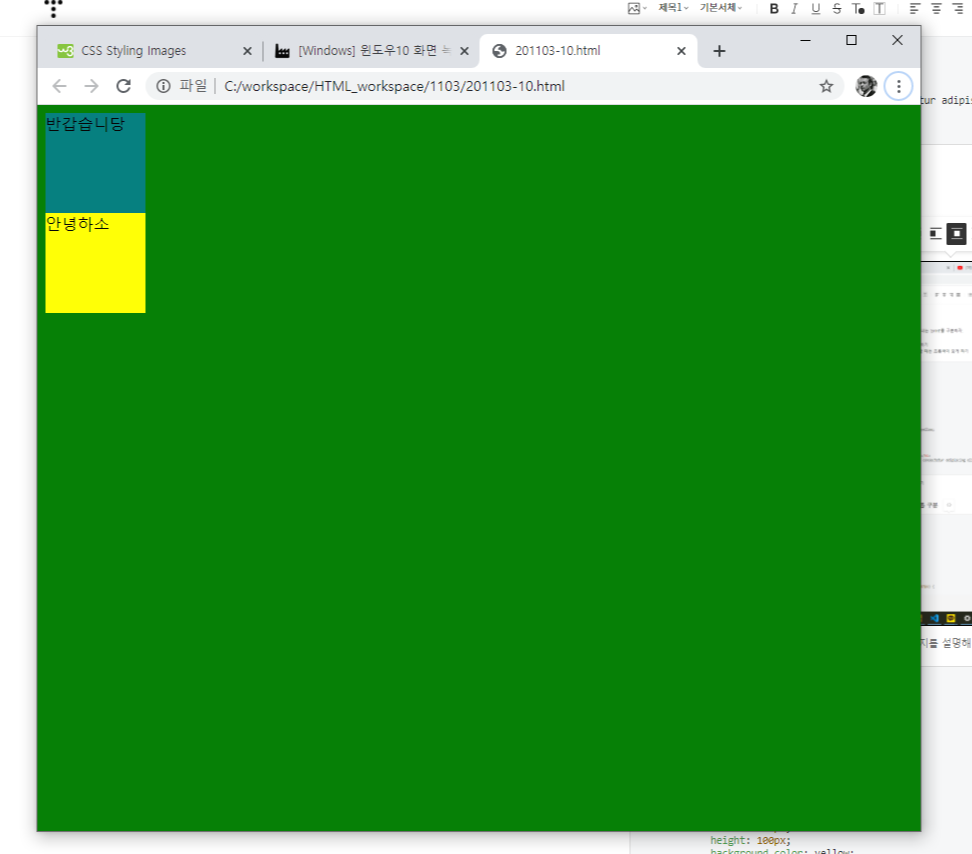
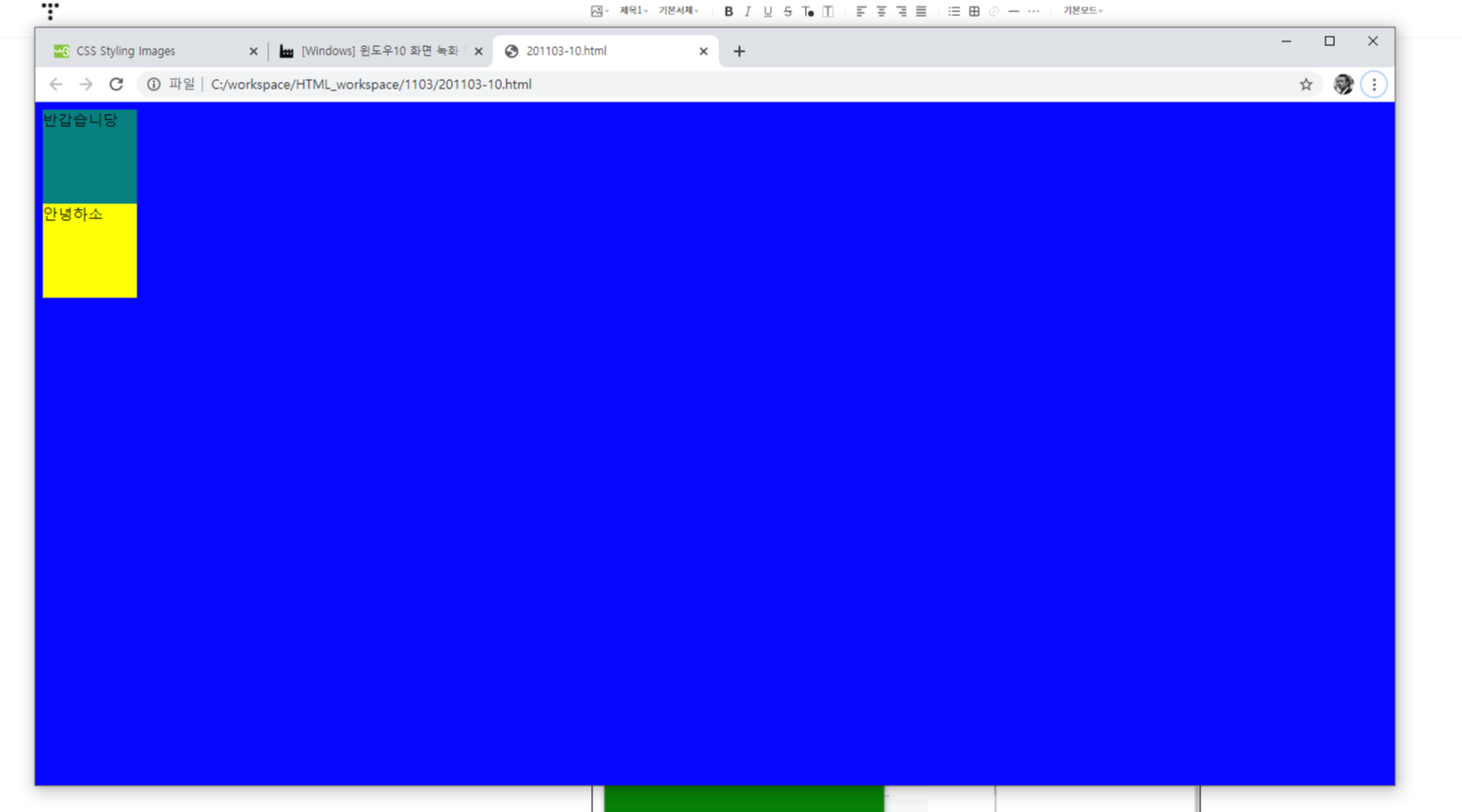
8-3 스마트폰, 태블릿 pc, 데스크톱 구분
<!DOCTYPE html>
<head>
    <meta charset="UTF-8">
    <title></title>
    <style>
        #box1 {
            width : 100px;
            height: 100px;
            background-color: teal;
        }
        #box2 {
            width : 100px;
            height: 100px;
            background-color: yellow;
        }
        @media screen and (max-width: 767px) {
            body {
                background-color : red;
            }
        }
        @media screen and (min-width : 960px) {
            body {
                background-color : blue;
            }
        }
        @media screen and (min-width: 767px) and (max-width : 959px) {
            body {
                background-color : green;
            }
        }
    </style>
</head>
<body>
    <div id = "box1">
        반갑습니당
    </div>
    <div id = "box2">
        안녕하소
    </div>
</body>
</html>
표8-4 미디어 특징
width : 화면 너비
height : 화면 높이
device-width : 장치 너비
device-height 장치 높이
orientation : 장치방향
device-aspect-ratio : 화면 비율
color : 장치 색상 비트
color-index : 장치에서 표현 가능한 최대 색상 개수
monochrome 흑백 장치의 픽셀당 비트 개수
resolution : 장치해상도
예제 8-4 화면 방향 전환
orientation 속성을 사용하여 화면 방향에 따라 다른 배경 색상을 적용한다.
8-8 orientation.html
@media screen and (max-width : 768px) and (min-width : 959px) {
body {
background-color : green;
}
}
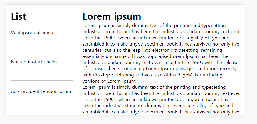
8-6 반응형 웹 패턴2
<!DOCTYPE html>
<head>
    <meta charset="UTF-8">
    <meta name="viewport" content="width=device-width, initial-scale=1.0">
    <title>Document</title>
    <style>
        * {
            margin : 0;
            padding : 0;
        }


        li {
            list-style-type: none;
            border-bottom: 2px rgb(194, 192, 192) solid;
            height : 50px;
            padding : 24px 0px;
        }
        .left {
            width : 500px;
            float : left;

        }
        .right {
            width : 600px;
            float : left;

        }
        @media screen and (orientation: portrait){
            .left {
                display : none;
            }
            body {
                padding : 20px;
            }
        }
        @media screen and (orientation: landscape) {
            .left {
                width : 30%;
                float : left;

            }
            .right {
                width : 70%;
                float : right;
            }
        }
        .content{
            padding : 16px;
        }
    </style>
</head>
<body>
    <div>
        <div class = "left">
            <div class = "content">
                <h1> List </h1>
                <ul>
                    <li>Velit ipsum ullamco</li>
                    <li>Nulla qui officia naim</li>
                    <li>quis proident tempor ipsum</li>
                    <li>et sunt sit culp ad</li>
                    <li>fugiat reprehenderit sint mollit.</li>
                </ul>
            </div>
        </div>
        <div class = "right">
            <div class = "content">
                <h1>Lorem ipsum</h1>
                <p>Lorem Ipsum is simply dummy text of the printing and typesetting industry.
                    Lorem Ipsum has been the industry's standard dummy text ever since the 1500s,
                    when an unknown printer took a galley of type and scrambled it to make a type specimen book.
                    It has survived not only five centuries, but also the leap into electronic typesetting, remaining essentially unchanged.
                    It was popularised orem Ipsum has been the industry's standard dummy text ever since tin the 1960s with the release of Letraset sheets containing Lorem Ipsum passages,
                    and more recently with desktop publishing software like Aldus PageMaker including versions of Lorem Ipsum.
                </p>
                <p>Lorem Ipsum is simply dummy text of the printing and typesetting industry.
                    Lorem Ipsum has been the industry's standard dummy text ever since the 1500s,
                    when an unknown printer took a gorem Ipsum has been the industry's standard dummy text ever since talley of type and scrambled it to make a type specimen book.
                    It has survived not only five centuries, but also the leap into electronic typesetting, remaining essentially unchanged.
                    It was popularised in the 1960s with the release of Letraset sheets containing Lorem Ipsum passages,
                    and more recently with desktop publishing software like Aldus PageMaker including versions of Lorem Ipsum.</p>
                <p>Lorem Ipsum is simply dummy text of the printing and typesetting industry.
                    Lorem Ipsum has orem Ipsum has been the industry's standard dummy text ever since tbeen the industry's standard dummy text ever since the 1500s,
                    when an unknown printer took a galley of type and scrambled it to make a type specimen book.
                    It horem Ipsum has been the industry's standard dummy text ever since tas survived not only five centuries, but also the leap into electronic typesetting, remaining essentially unchanged.
                    It was popularised in the 1960s with the release of Letraset sheets containing Lorem Ipsum passages,
                    and more recently with desktop publishing software like Aldus PageMaker including versions of Lorem Ipsum.</p>

            </div>
        </div>
    </div>
</body>
</html>'HTML5' 카테고리의 다른 글
| 첨부파일에 특정 확장자만 첨부하기 (0) | 2021.09.03 |
|---|---|
| 종합 예제 2 (0) | 2020.11.03 |
| 연습문제 8-5 반응형 웹 (0) | 2020.11.03 |
| chapter 07 다양한 레이아웃의 구성과 기능, 연습문제 (0) | 2020.11.02 |
| 7-4 절대위치배치 7-5 요소의중앙배치 7-6 고정바배치 7-7 글자생략 (0) | 2020.11.02 |