반응형
웹사이트 따라만들기, 반응형 헤더편 | 프론트엔드 개발자 입문편: HTML, CSS, Javascript
기존에 아는 지식들을 점검하고자 따라했으나, 생각보다 모르는 새로운 것들이 많더라
완성 코드
HTML
<!DOCTYPE html>
<html lang="en">
<head>
    <meta charset="UTF-8">
    <meta http-equiv="X-UA-Compatible" content="IE=edge">
    <meta name="viewport" content="width=device-width, initial-scale=1.0">
    <title>NAV BAR</title>
    <link rel="stylesheet" href="style.css">
    <link href="https://fonts.googleapis.com/css2?family=Source+Sans+Pro:wght@300&display=swap" rel="stylesheet">
    <script src="https://use.fontawesome.com/releases/v5.2.0/js/all.js"></script>
    <script src="main.js" defer ></script>
</head>
<body>
    <nav class="navbar">
        <div class="navbar__logo">
            <i class="fab fa-reddit"></i>
            <a href="">YU WORLD</a>
        </div>
        <ul class="navbar__menu">
            <li><a href="">Home</a></li>
            <li><a href="">Gallery</a></li>
            <li><a href="">Wedding</a></li>
            <li><a href="">FAQ</a></li>
            <li><a href="">Bookings</a></li>
        </ul>
        <ul class="navbar__icons">
            <li><i class="fab fa-twitter"></i></li>
            <li><i class="fab fa-facebook"></i></li>
        </ul>

        <a href="#" class="navbar__toggleBtn">
            <i class="fas fa-bars"></i>
        </a>
    </nav>
</body>
</html>
CSS
:root {
--text-color: #f0f4f5;
--background-color: #263343;
--accent-color: rgb(87, 170, 166)
}
body {
margin : 0;
font-family: 'Source Sans Pro';
}
a {
text-decoration: none;
color: var(--text-color);
}
.navbar {
display: flex;
justify-content: space-between;
align-items: center;
background-color: #263343;
padding: 8px 12px;
}
.navbar__logo {
font-size: 24px;
color: cadetblue;
}
.navbar__menu li {
padding: 10px 20px;
}
.navbar__icons {
list-style: none;
display :flex;
color:white;
padding-left: 0px;
}
.navbar__icons li {
/* padding: 8px 12px; */
}
.navbar__menu {
display: flex;
list-style: none;
padding-left: 0px;
}
.navbar__menu li {
padding: 8px 13px;
}
.navbar__menu li:hover {
background-color : rgb(87, 170, 166);
border-radius: 5px;
}
.navbar__icons li {
padding : 10px;
}
.navbar__toggleBtn {
display: none;
}
@media screen and (max-width: 768px) {
.navbar {
flex-direction: column;
align-items: flex-start;
padding : 10px 24px;
}
.navbar__menu {
display: none;
flex-direction: column;
align-items: center;
width: 100%;
}
.navbar__menu li {
width: 100%;
text-align: center;
}
.navbar__icons{
display: none;
width: 100%;
justify-content: center;
}
.navbar__toggleBtn {
display: block;
position: absolute;
right : 20px;
font-size: 24px;
color :rgb(87, 170, 166);
}
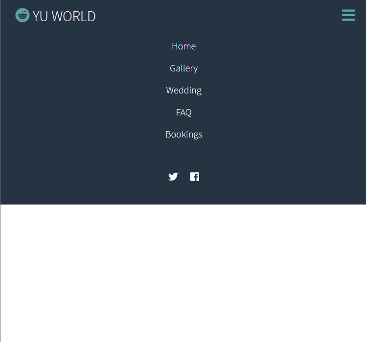
.navbar__menu.active,
.navbar__icons.active {
display: flex;
transition: 1s ease-out;
}
}JS
const toggleBtn = document.querySelector(".navbar__toggleBtn");
const menu = document.querySelector(".navbar__menu");
const icons = document.querySelector(".navbar__icons");
toggleBtn.addEventListener("click", () => {
menu.classList.toggle('active');
icons.classList.toggle('active');
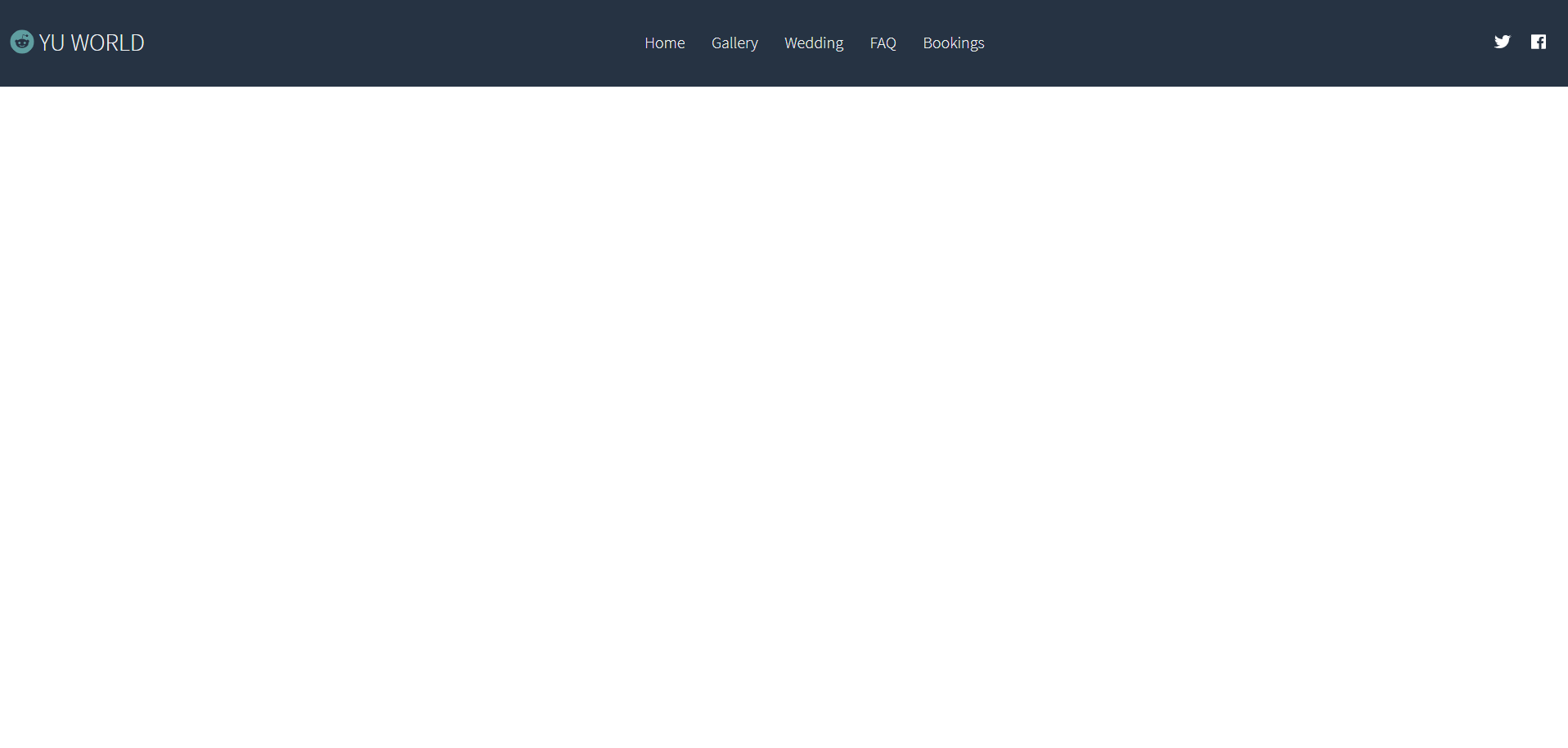
})완성된 화면을 보자면
반응형
display: flex 속성
display : flex;
//display: flex; 속성으로 한 줄 정렬 시키기
justify-content : space-between;
justify-content : space-around;
justify-content : center;
박스 사이에 스페이스를 넣는다
같은 중심축에서 넣기때문에
align-items 수직으로 중심 정렬할 수 있다.
list-style : none;
li 태그 스타일 삭제
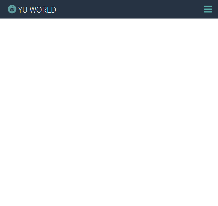
- 반응형 만들 때
media query를 이용한다. 너비가 768px보다 작을 때 실행
@media screen and (max-width: 768px) {
 flex-direction: column;
        align-items: flex-start;
}
문서 흐름에서 나오기
position: absolute;
HTML에 script를 추가할 때는
defer을 통해서, javascript 로딩 전에도 html을 로딩할 수 있게 한다.
<script src="main.js" defer ></script>
color: white; 와 같이 일일이 색상을 입력하기 보다는
기본 text-color, backgroundcolor를 지정해두고
var(--text-color) 로 사용이 가능하다.
:root {
    --text-color: #f0f4f5;
    --background-color: #263343;
    --accent-color: rgb(87, 170, 166)
}
나중에 보면 좋을 것 같은 참고 블로그
transition, animation, flex
1.transition 2.animation 3.flex 모델 -flex-wrap -justify-content -align-items ----------------------...
blog.naver.com
반응형
'HTML, CSS' 카테고리의 다른 글
| [CSS] position: absolute 중앙정렬 (0) | 2022.01.29 |
|---|---|
| css로 마우스 드래그 막기 (1) | 2022.01.13 |
| mousehover시 opacity 부드럽게/천천히 변경 (0) | 2021.08.12 |
| [css] <iframe> (0) | 2021.07.09 |
| input에 null값 넣지 못하게 하기, required (0) | 2021.02.16 |